
Apart from regular Internet users, a new segment of users prefer the mobile device, such as smart phones and tablet PCs are growing at a tremendous rate. Your future marketing strategy should not ignore this rapidly growing audience for mobile business promotion.
What is Mobile SEO?
The mobile SEO is a process to develop and optimize the website considering mobile navigation attributes such as device type, screen size, screen resolution and used mobile browser. The optimized Mobile Website takes into account different criteria for mobile audience works best in Google SERP Served in mobile audience for mobile browsing environment.
How Google collects the data from the Mobile Web?
As Google Bot crawl Web data, Google has a personal tracker for mobile websites that tracks the mobile Web information. Optimizing your website for mobile navigation perspective this mobile tracker and mobile users are needed to promote your website efficiently among these audiences. Google has a different algorithm for indexing websites and establish priorities for mobile browsing. So if you have a personal mobile website you must optimize your website properly as described below in brief or contact any highly deserving SEO Company.
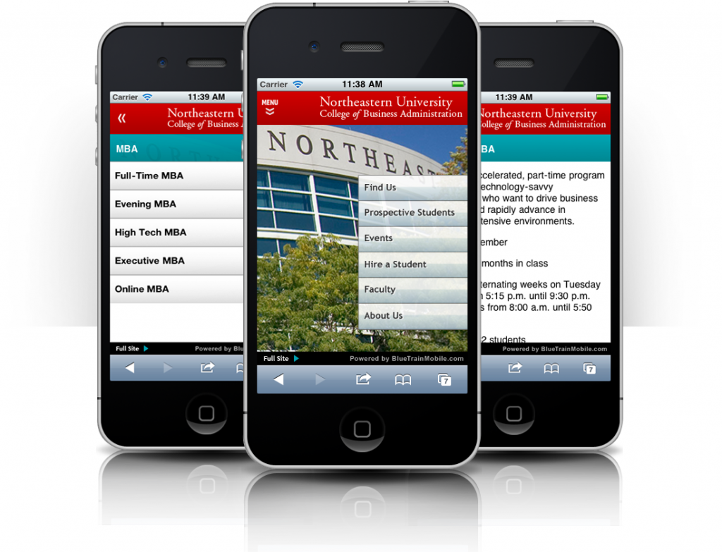
Two Scenarios for the Development of Mobile Compatible Website
The ultimate goal of having a mobile website is to provide better user experience to the mobile audience according to the mobile navigation environment in which they have been watching your website as per your screen size and resolution. There are two different ways you can implement to serve content to the mobile audience.
1) HTML Responsive
In this scenario, a web designer has to develop a separate CSS and the need to implement HTML code that is specific to different mobile users. When someone visits your website, it is necessary to detect the user agent and serve that user CSS and HTML accordingly. Therefore, if someone visits your site from a mobile device, your website is served with HTML and CSS which have been coded according to mobile screen resolution and if normal desktop or notebook users, the desktop version of the website that is served.
2) Web Hosting Mobile Individually
Another way to develop a mobile website is to have a separate mobile website hosted on a sub domain. In this scenario, design of an independent website which is compatible with mobile screen size and different resolutions is considered. The technique is the same; you have to detect the user agent and the need to redirect users to the mobile site instead of serving the web page with HTML and CSS differently from responsive website.
Key difference between above said:
a) Creating a responsive website is a bit more complicated and difficult, since one has to think about design all you need to fit with the two different versions HTML, CSS. The complexity does not grow as total distinguished design in the website grows. The unique design gets served in different ways depending on screen size and resolution different.
It is easier to develop a single mobile website that is hosted in a single sub-domain, as the designer has to create a design taking into account the individual situation of the mobile audience.
b) With the responsive website, serving mobile optimized content with a URL of the website of the same desktop version is considered to be easier to use.
In the case of large web sites a single mobile website is easier to use compared to the sensitive and can host images, files and other resources separately for the mobile website.
c) With mobile websites, you can optimize the web site speed in certain rules, which is a bit tricky with responsive websites.
The basic principle is to create a better user experience for mobile users, even after the creation of the appropriate design for mobile browser as screen size and resolution, you must continually evaluate the behavior of mobile web users and treat to implement the best available to make mobile users more comfortable.


Leave a Reply